You’ve definitely heard the word “brand” before and most likely heard the word, “brand Identity” too. But what is the difference?
In a world full of brands (businesses), clients are overwhelmed with options. Oversaturated industries, advances in technology, and the immediate access to information have blurred the lines between physical and digital – this consumer shift is forcing businesses to rethink the way they engage with their clients and followers.
What effectively differentiates one business from another and ultimately drives success – is branding.
Branding:
Branding is the complete experience that you create around your business.
Think about the last time you had a really positive spending experience. And not just spending money, but time or energy. When was the last time you engaged with a business – saw a movie, went out to eat, bought some clothes, subscribed or joined a membership? What was it about that experience was so positive? What makes you want to promote that business to your friends and family for free? That’s branding.
Branding is the complete experience that you create around your business. Every possible touchpoint in which a client could potentially come in contact with your brand is carefully designed to evoke a specific feeling or response.
Even if you sell a product or offer a service that is widely available within your market, why would/should someone purchase yours vs another’s? It’s this differentiation (branding) that defines your business and helps you stand out.
Real World Example: Pepsi vs. Coke
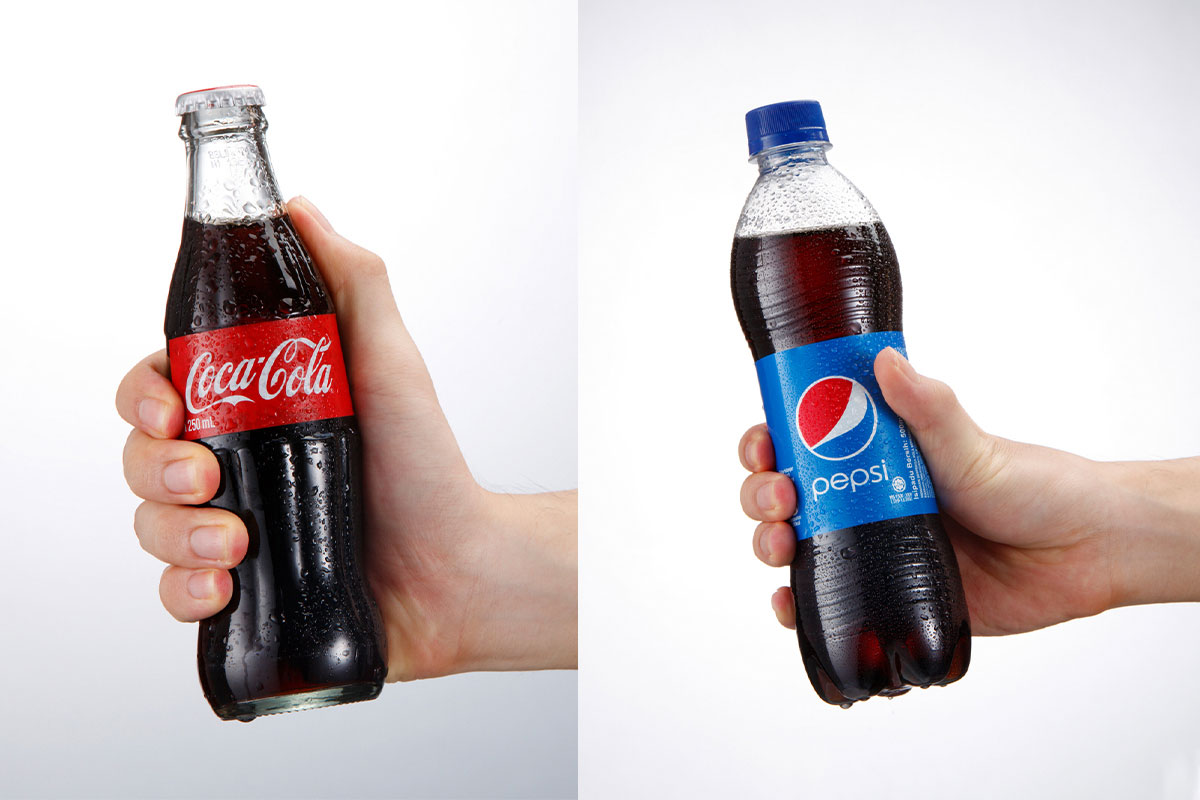
While Pepsi and Coke both sell the same product – cola soda – people always have a preference for which they would rather have. I was a waitress for years before starting Whiskey & Red and when I would inquire about what someone wanted to drink, if they wanted cola, they would always ask for either “Pepsi” or “Coke,” never just “cola.” Both companies, while selling the same product, promote to very unique target market groups.
Coke is the original, the classic, the family brand. Their marketing always has a family feel: little kid pulling a red wagon and sharing a coke, retro vintage polar bears, old glass bottles… they represent the family brand. A company focused on backyard BBQs and events that bring people and families together.
Pepsi is the new, “the next generation,” the energy. Their marketing, while also focused on bringing people together, is usually visually communicated through young adults partying on a beach, or rooftop in the city or driving in a convertible with the top down. They are the younger generation, the lifestyle brand.
But just because Coke promotes a more traditional or classic look doesn’t mean young people won’t like them. And the same goes for Pepsi – just because they focus on the younger generation doesn’t mean older consumers won’t choose them. It’s the lifestyle that each represents that ultimately speaks to their target consumers and cultivates lifelong and incredibly loyal fans. It’s the perception of each business (brand) that makes them unique – even when they sell the same thing.
So, how do you manage the perception of your business and visually differentiate yourself from your competition? Through a compelling brand identity.
Brand Identity:
A well-designed brand creates an experience, cultivates a community, and amplifies customer demand. Branding is the experience a business cultivates around its scope and services. A Brand Identity is any of the visual elements that help shape that experience.
Everything that you perceive for a business should be carefully considered during its creation in order to design the right brand identity that will effectively communicate with a target client group. While the logo and color palette are one part of that identity puzzle, there is so much more to it.
Visual Identity Systems are the complete package or set of visual elements that a company uses to visually or audibly communicate their brand. These include logos, color palettes, typography, stationery, photography, icons, videography, music, motion graphics, print or digital marketing, signage and more.
Our success is no longer bound by our physical locations, making our digital presence ever more critical, and in turn, making our visual brand identity that much more valuable.
Take a moment and consider all the ways your clients engage with your brand? Websites, social media, mobile devices, digital marketing, email marketing, podcasts, audiobooks, streaming platforms, packaging and beyond. The technology shift I mentioned earlier has completely redefined business. Our success is no longer bound by our physical locations, making our digital presence ever more critical, and in turn, making our visual brand identity that much more valuable.
But, when it comes to brand identity, just because something looks good doesn’t mean it’s right for your business. Significant market and brand research should be apart of the development process for your brand to ensure that you are visually communicating the right message, that it is being received by the right people, and that it is received in the way it was designed to be received.
Real Word Example: Pepsi vs. Coke again

Going back to our previous comparison of Coke and Pepsi, both do a fabulous job of aligning their branding (experience) with their brand identity. While many similar choices were made – they are selling the same product in a competitive market after all – they both have dramatically different brand identities that perfectly align with their brand values, vision and target market.
Coke is the Original, so it makes sense that after over 100 years in business, they are staying true to their “original” logo. A very recognizable vintage script with the intertwining tails of the two “Cs”. They have tweaked and refined the mark through the years, but the overall “original” timeless and traditional look to their logo has stayed the same.
As I mentioned, a logo and color palette is just one part of the Brand Identity system. If you visit Coke’s website or Facebook page, you’ll see everything from their retro filtered photography, and marketing videos to their promotional adds all keep that classic timeless look and feel to them.
Pepsi, the new, made very specific design choices for its brand identity that better aligned with “new” “fresh” and “next generation.” Despite their very modern current look – their original logo was very close to Coke’s. After realizing that directly competing with the cola powerhouse wasn’t the answer, and major refinements to their brand target market, they then made significant changes to their look and overall brand identity feel – currently, all-lowercase, rounded geometric typeface paired with their clean, flat circular icon of two wave shapes. The shape of the waves and placement of the wordmark has adjusted through the years, but the overall colors and goals of the design have always stayed consistent, keeping Pepsi recognizable, despite redesigns.
Like (and so unlike) Coke, Pepsi, keeps their “modern” and “fresh” brand identity consistent through their website and social platforms, leveraging more modern design choices and trends.
A Powerful Combination
The consistent partnership between your Branding and your Brand Identity is what makes it easy for a customer to choose you. Taking charge of both how and where your clients can engage with your brand will open up your business to exponential growth opportunities, increase conversions, and elevate your brand’s loyalty.


