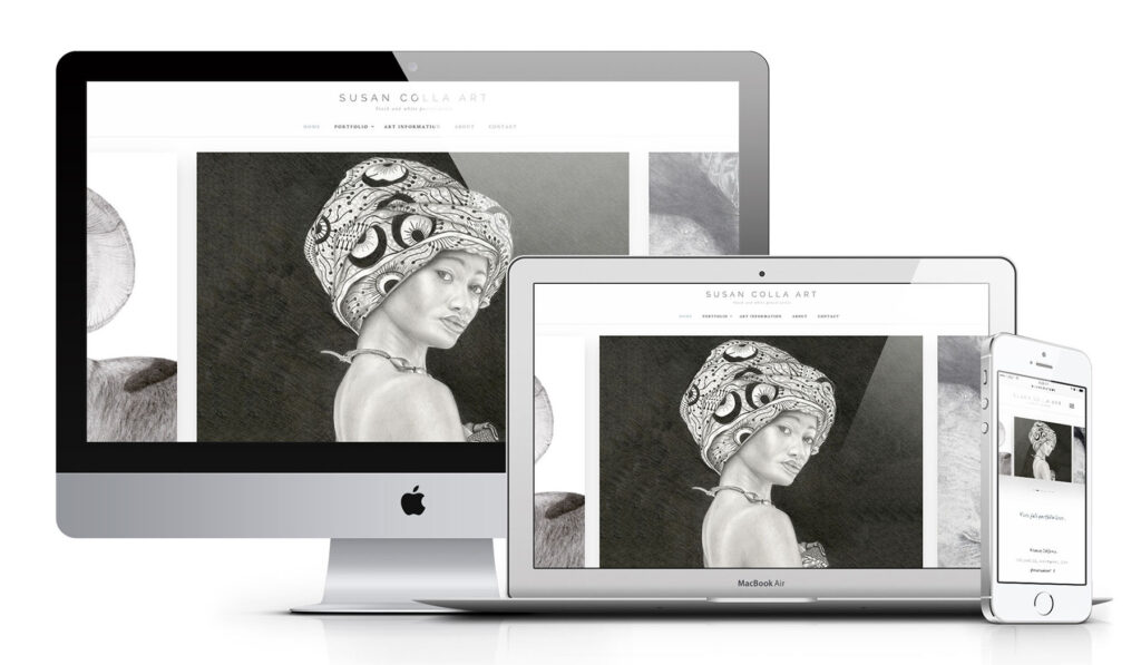
Susan Colla, a local pencil artist based out of Ventura, California reached out to us with the need of quickly redesigning her website onto the WordPress platform, before her current website’s platform was discontinued by her host company.
With a bit of a time crunch, we knew we needed to act fast while designing a site that would not only last our client through the foreseeable future but make a more significant impact on her ideal clients in her target market.
Susan is a black and white pencil artist, specializing in both domestic and wild animals as well as custom portraits of people, so her craft is incredibly specific. We wanted to clearly display the quality and specificity of her work on the new site as to best showcase her artwork and attract the right clients for her services.
But most importantly, we wanted to make sure the design was simple enough for Susan to update and maintain on her own as she continued to draw and add new pieces to her galleries.
Goals:
- Keep it simple, yet significant.
- Short timeframe – quick build.
- Emphasize the handcrafted quality of her artwork.
- Better communicate her services as to eliminate clients looking for a different kind of art, and attract the ideal clients to her business.
- Move client over to WordPress platform.
- Create and easily maintainable platform for the client to manage on her own.
What’s more classic than black and white, right?
Instead of going crazy with galleries and all the beautiful imagery options available to us through WordPress, we kept everything as simple and classic as possible.
- Clean and consistent black and white color palette.
- Clean and balanced sans and serif font pairings.
- Traditional navigation to help potential clients navigate to the right gallery for them.
- Single custom contact form with easy image uploading for clients to attach their commission photo requests, eliminating any confusion or inconsistencies for Susan’s client intake process.
The most important element on the site was the art. Creating an easily maintainable and engaging display feature for Susan’s galleries was our primary focus so we utilized a clean masonry gallery with lightbox functionality to allow clients to enlarge and view Susan’s work in detail, complete with descriptions and purchasing information associated with each piece of work.
To top off the overall site design, we knew that Susan’s primary marketing platform was Facebook, so the majority of her traffic was coming from social media. Having a clean responsive design that looked great on desktop but equally great and functional on mobile was important.
Again, thinking simple, all decisions were made to create the most seamless and smooth experience despite the device used to view the site.
Launching right on time, we were able to create this simple, clean, modern WordPress website and maintain that significant impact online that Susan’s art evokes in person.
The End Result

Just because there are endless options available to us through the web, doesn’t mean that we always need to use them. Social media, blog feeds, multiple forms, video, animations, subscriptions, pop-ups… The list of options can feel endless, but having a clear goal in mind for not only how you want your site to look, but how it needs to work will help you make the clearest decisions as to what’s best for your small business.
Ask Yourself:
- What is the number one goal you have for users on your website? (contact you, buy now, subscribe, comment, follow…etc)
- What website features will help assist your clients in accomplishing that goal? (custom forms, videos, free downloads, pop-ups, portfolios, blogging…etc)
- How transparent is your website? (how clear is your navigation in getting your clients to that primary goal)
- What’s your lost strategy? (how easy is it for clients to contact you if they have more questions or concerns before committing and accomplishing your website goal?)
Everyone uses the web differently. Knowing exactly who you are marketing and speaking to while answering the questions above will make the answers so much easier to find and your website so much easier to design.


