Never Settle for Standard
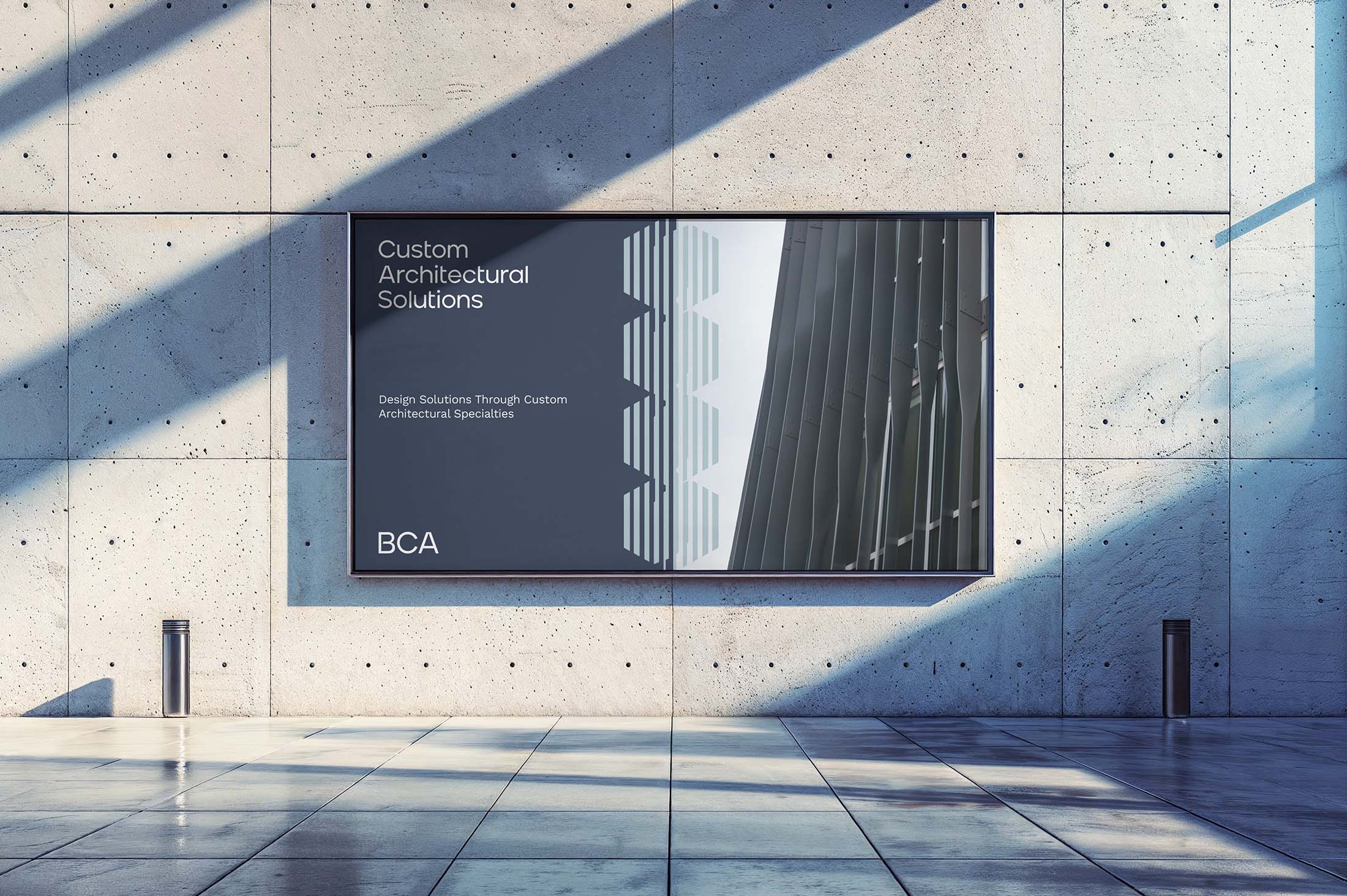
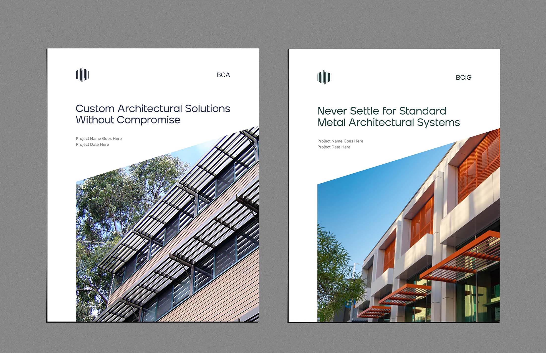
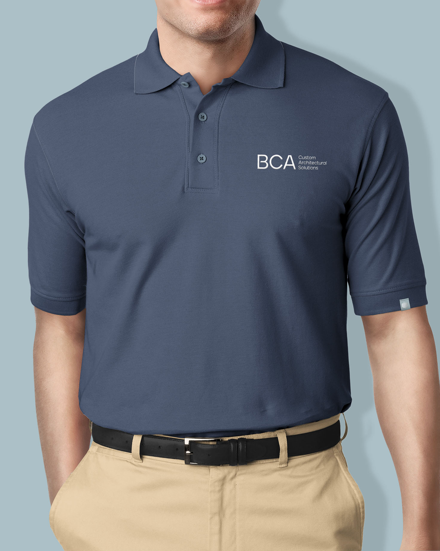
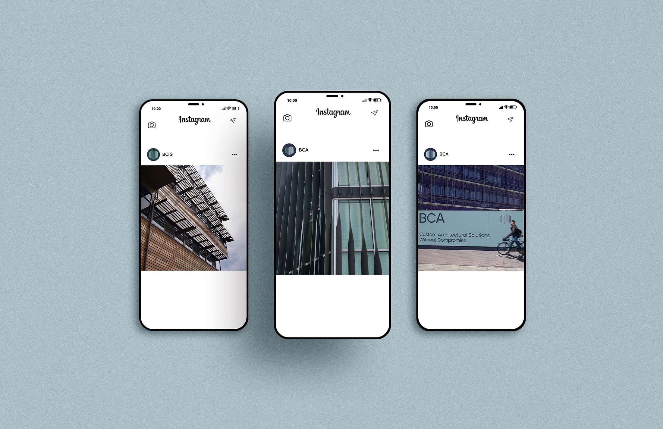
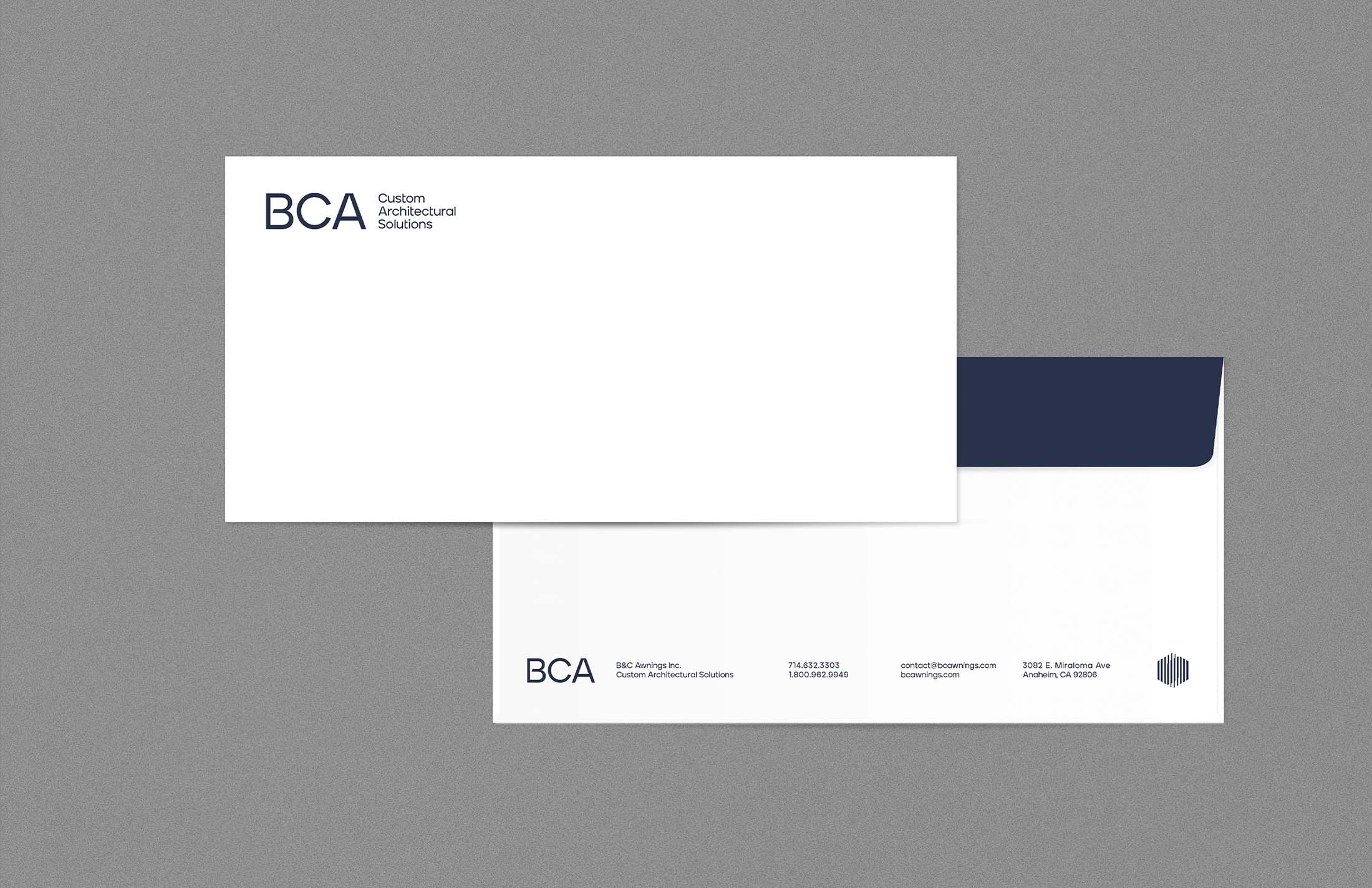
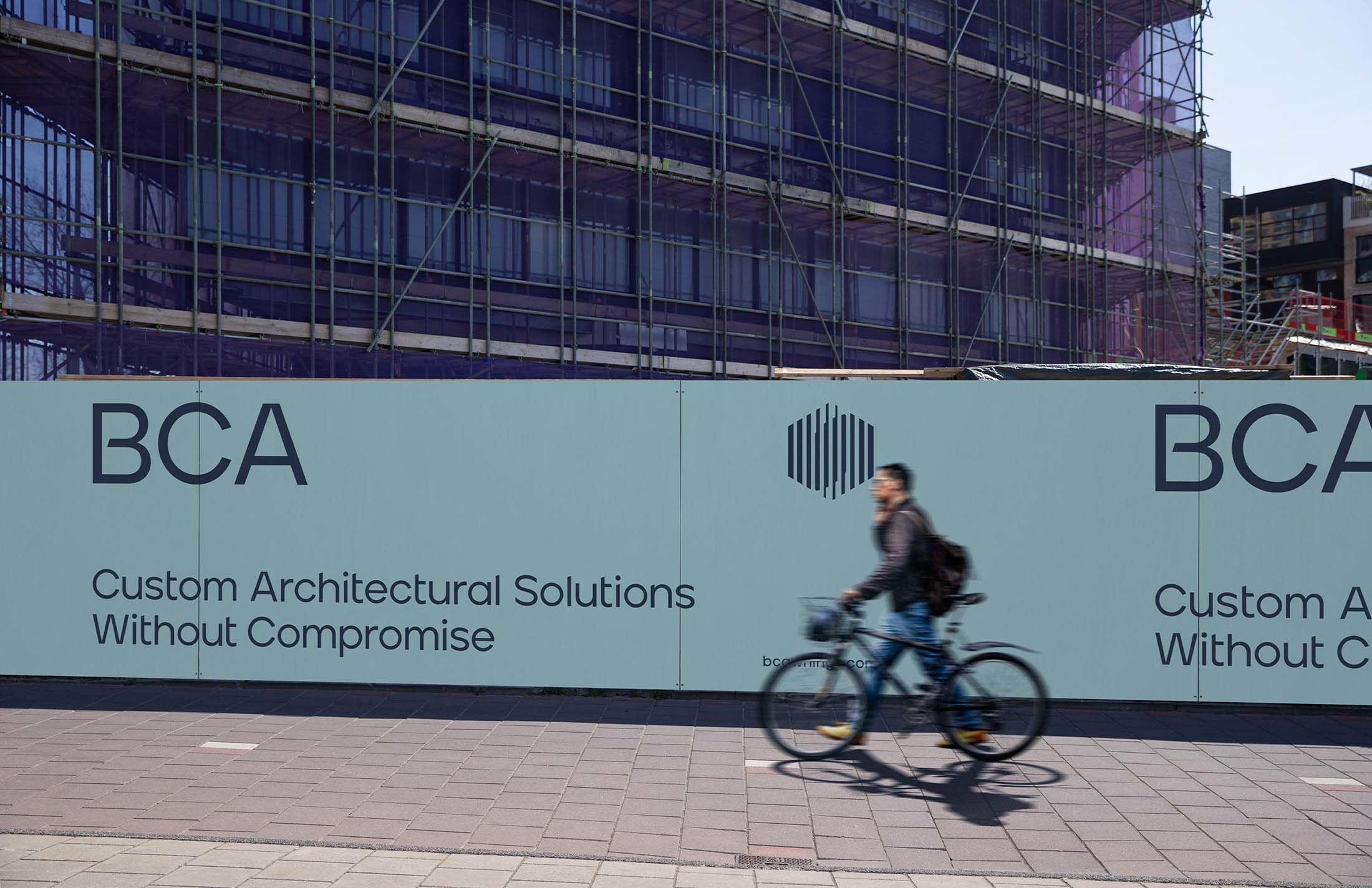
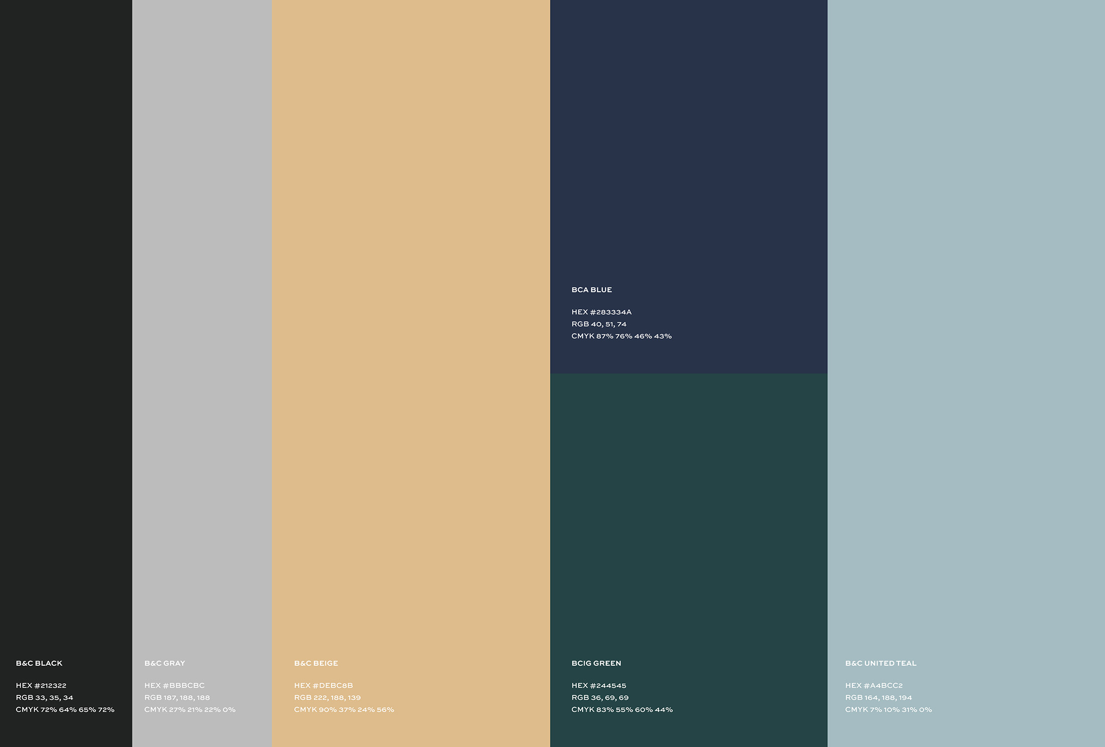
B&C Awnings came to us seeking to bring clarity, cohesion, and strength to their identity across multiple branches of architectural services. They needed a brand system that could empower each division to stand on its own while staying connected to the authority and credibility of the parent brand. We dove in with a focused urgency, crafting a cohesive identity system anchored by a unifying mark, typography system, and color palette that threads through every department. The result? A family of brands that’s distinct yet undeniably linked, capturing the essence of B&C Awnings’ legacy while setting each branch up for growth and visibility in their unique markets.
Visual Depth and “Shade”
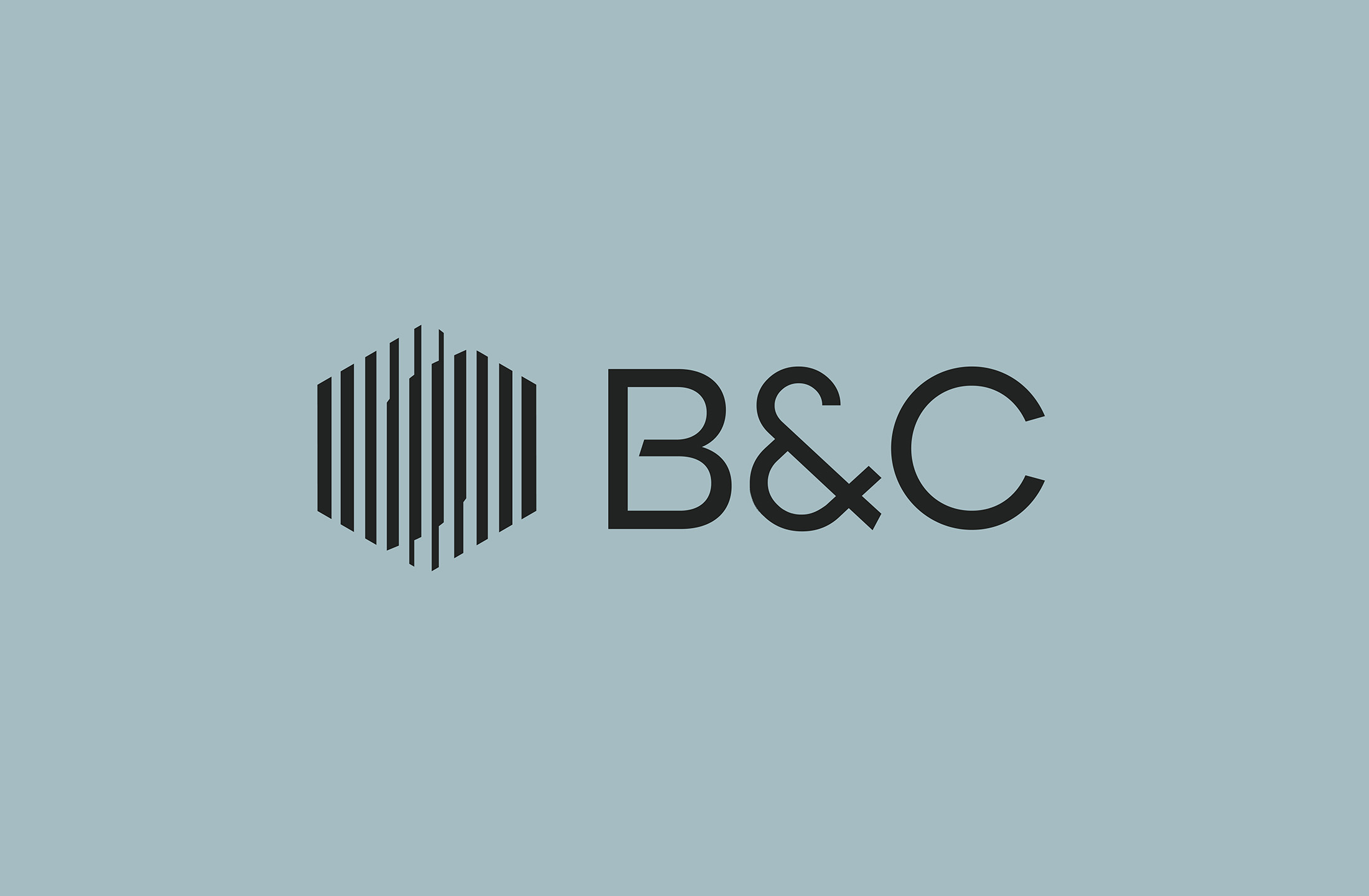
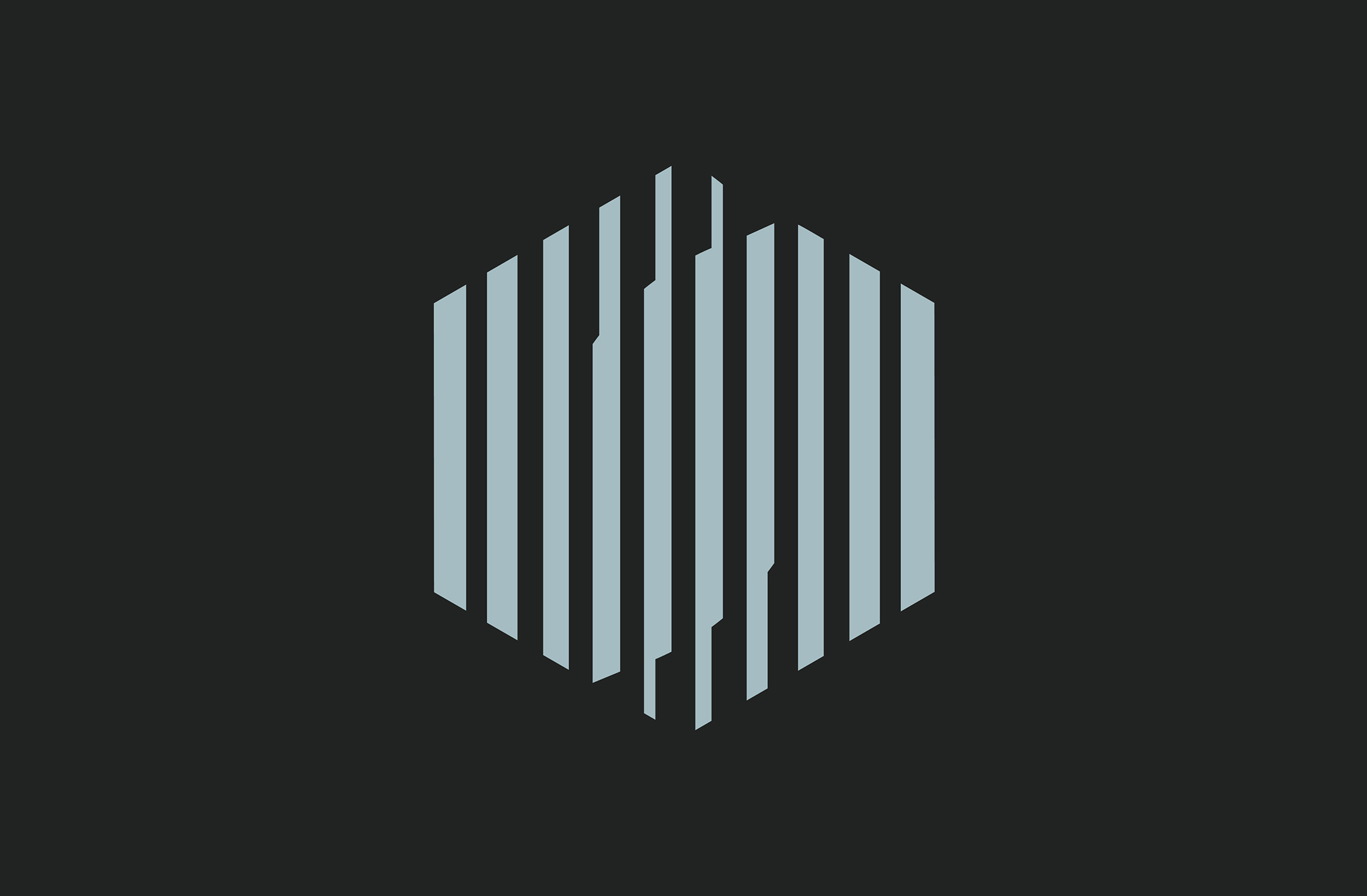
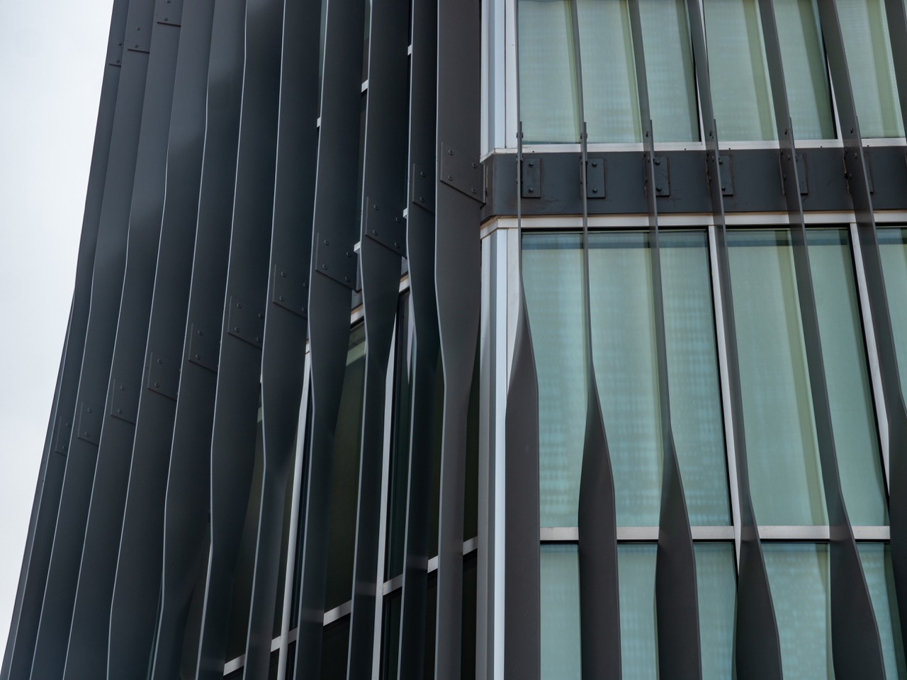
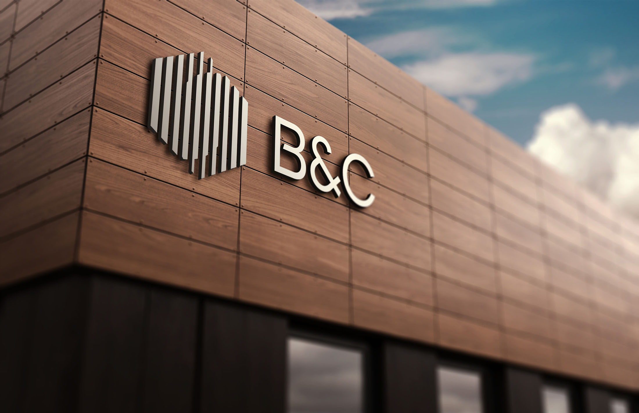
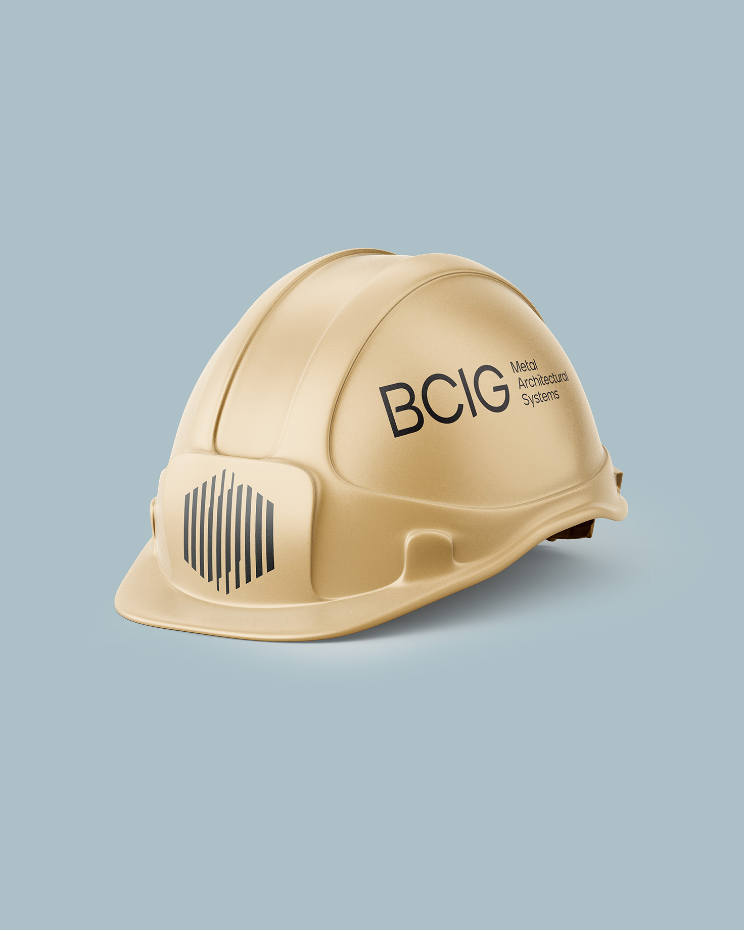
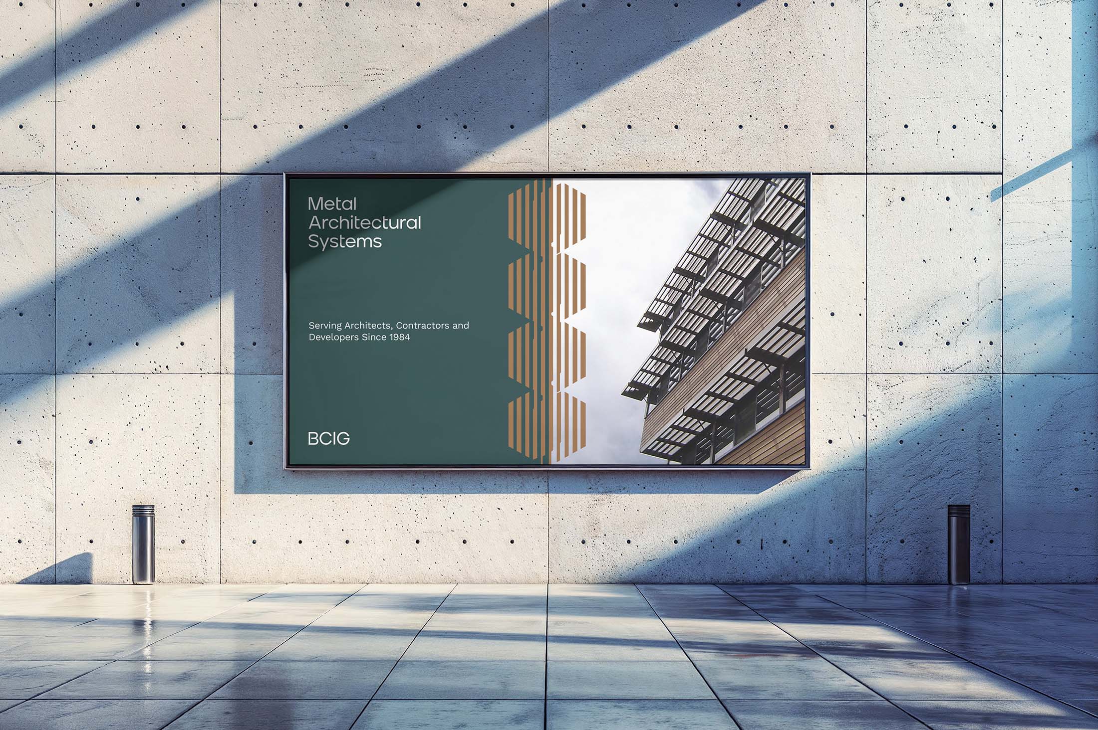
The B&C Awnings brand icon uses a flat, geometric design to create a sense of depth and shade, honoring the industry and products they craft for clients—shade solutions that blend form with function.
Symbol of Strength and Cohesion
The hexagonal shape itself, rooted in geometry and symmetry, is a powerful symbol of strength and cohesion, reflecting the precision and reliability that B&C brings to each architectural project.
Never Settle for Standard
This design reflects B&C's vision, "Never settle for standard," by embodying a forward-thinking, high-quality approach in every project.
