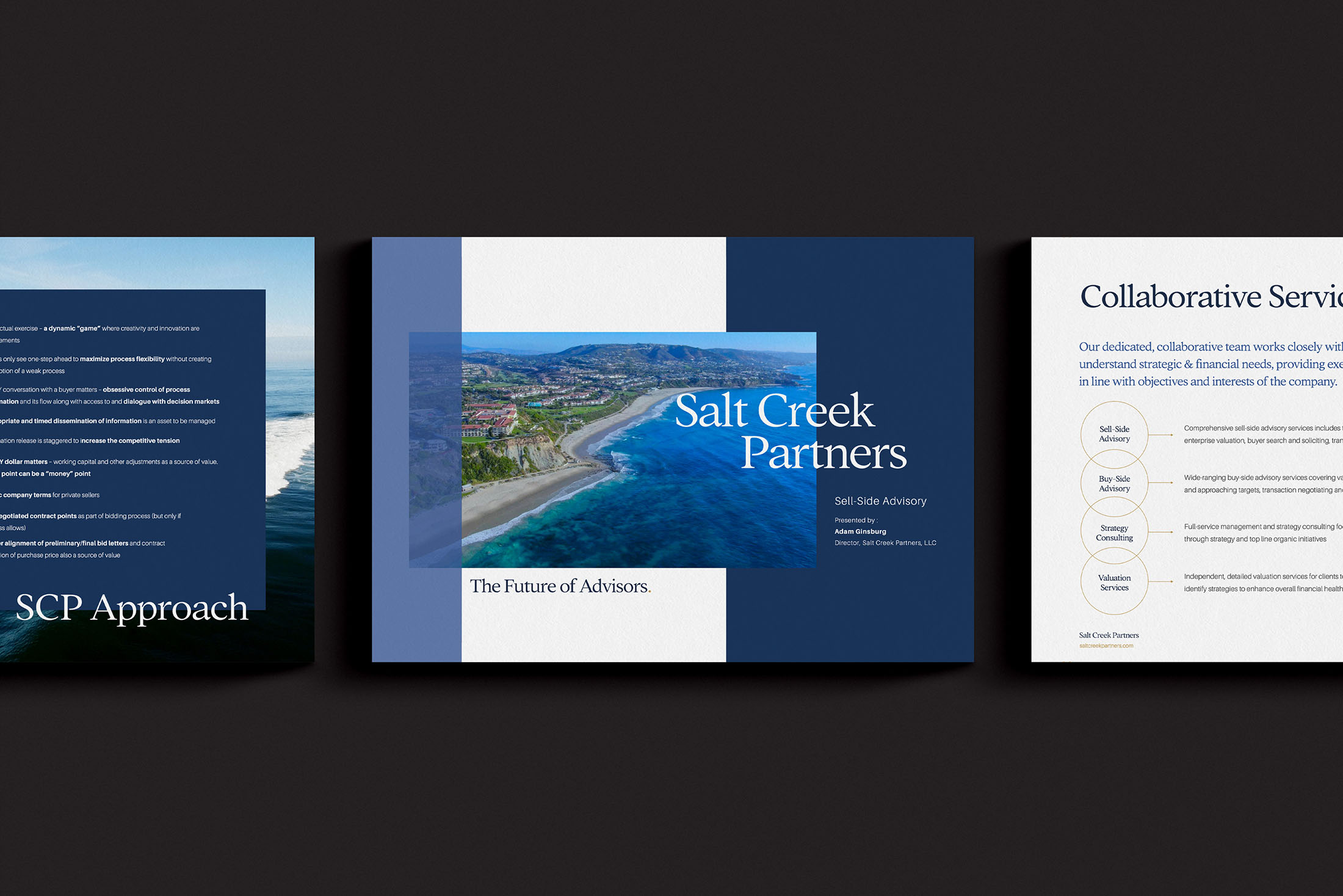
Branding & Website Design for Mergers & Acquisitions
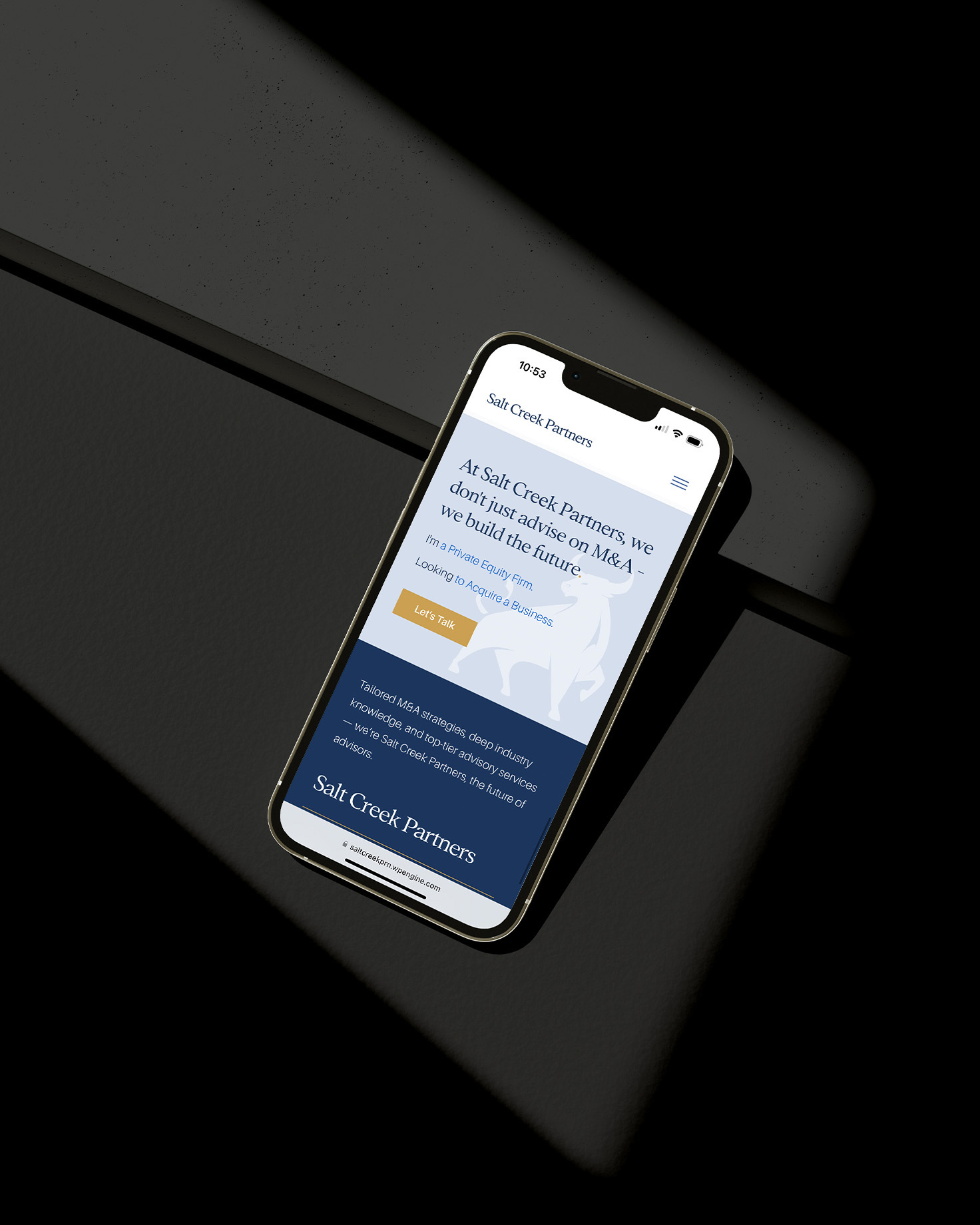
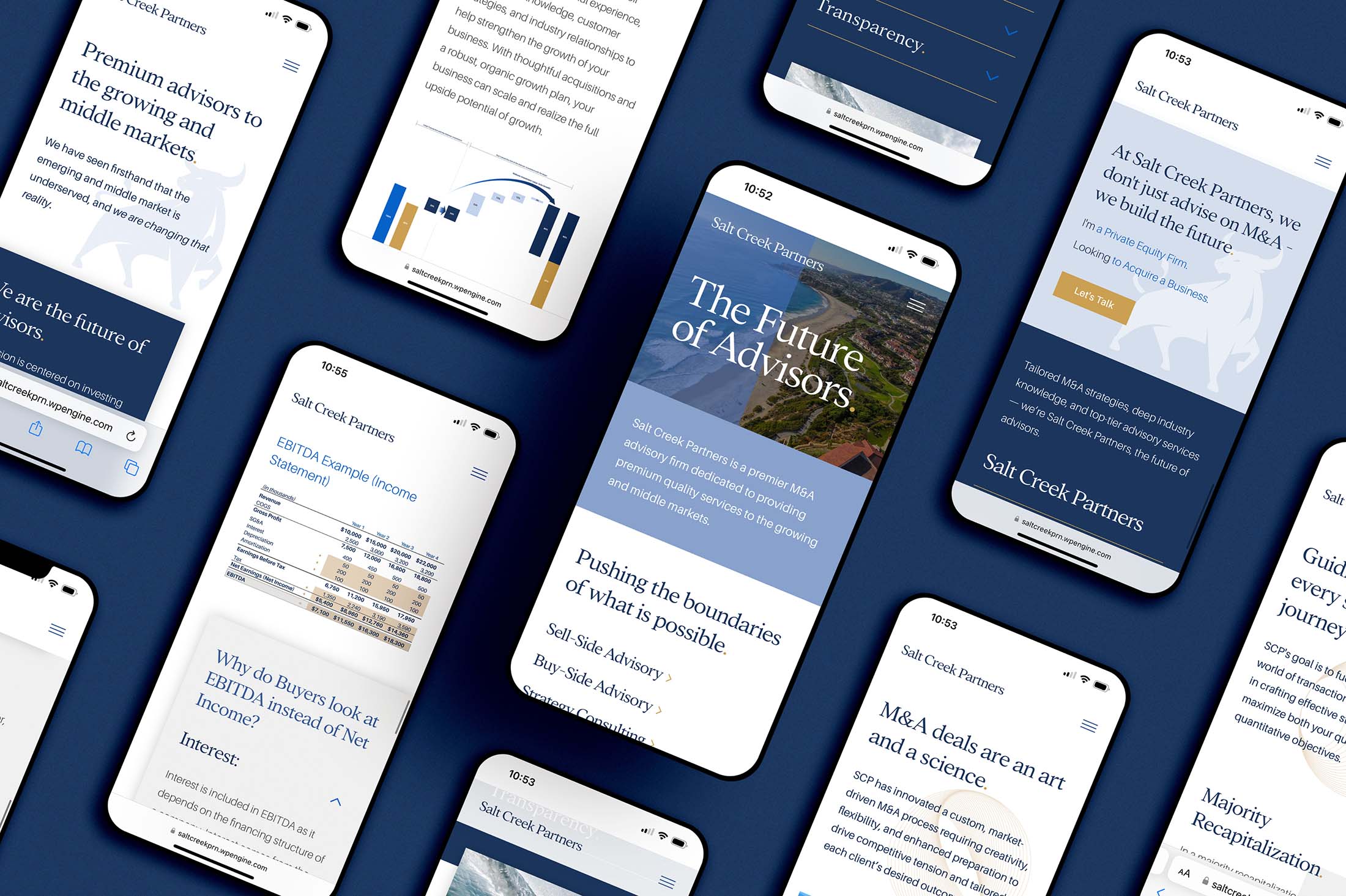
A premier M&A advisory firm dedicated to providing premium quality services to the growing and middle markets.
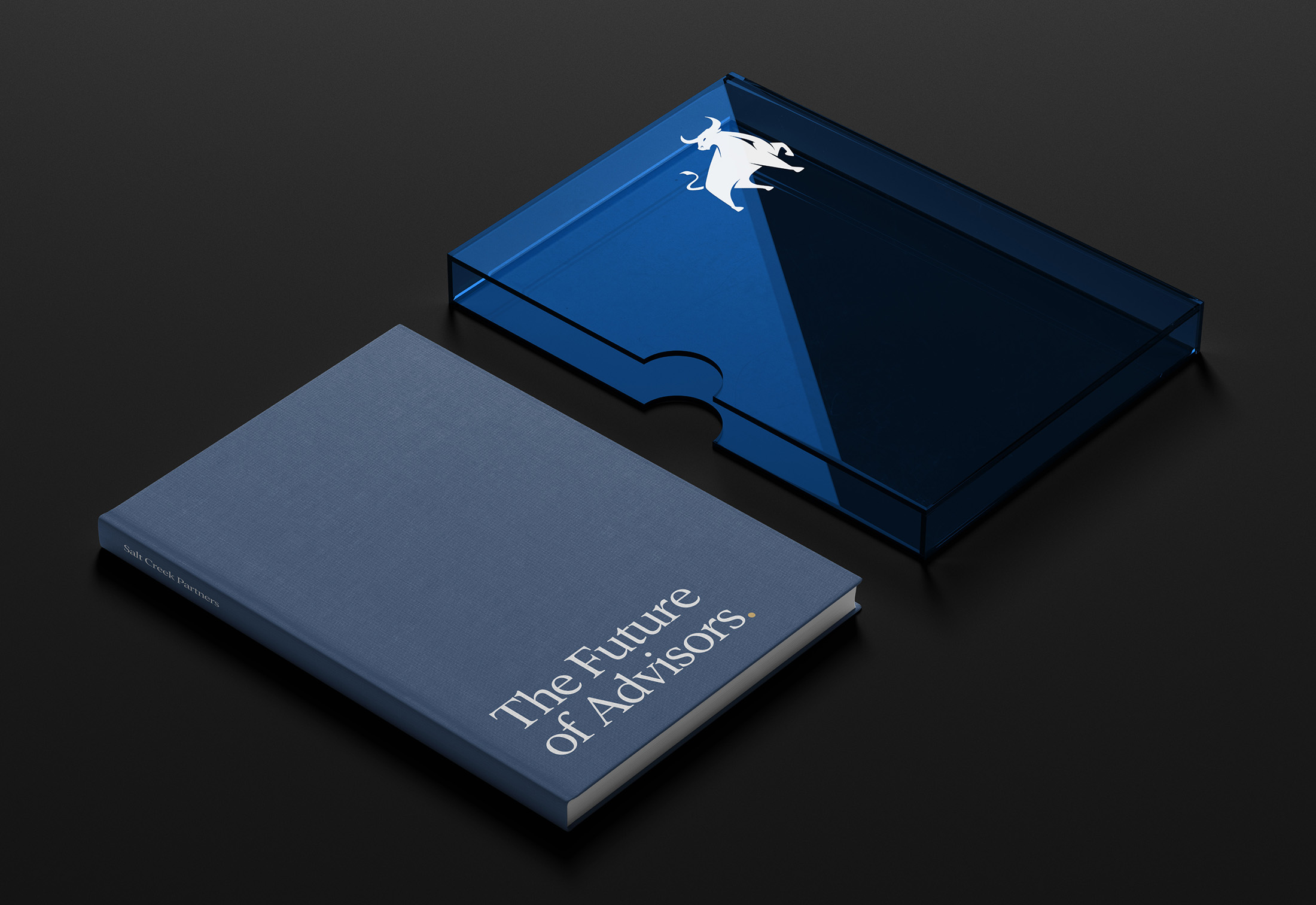
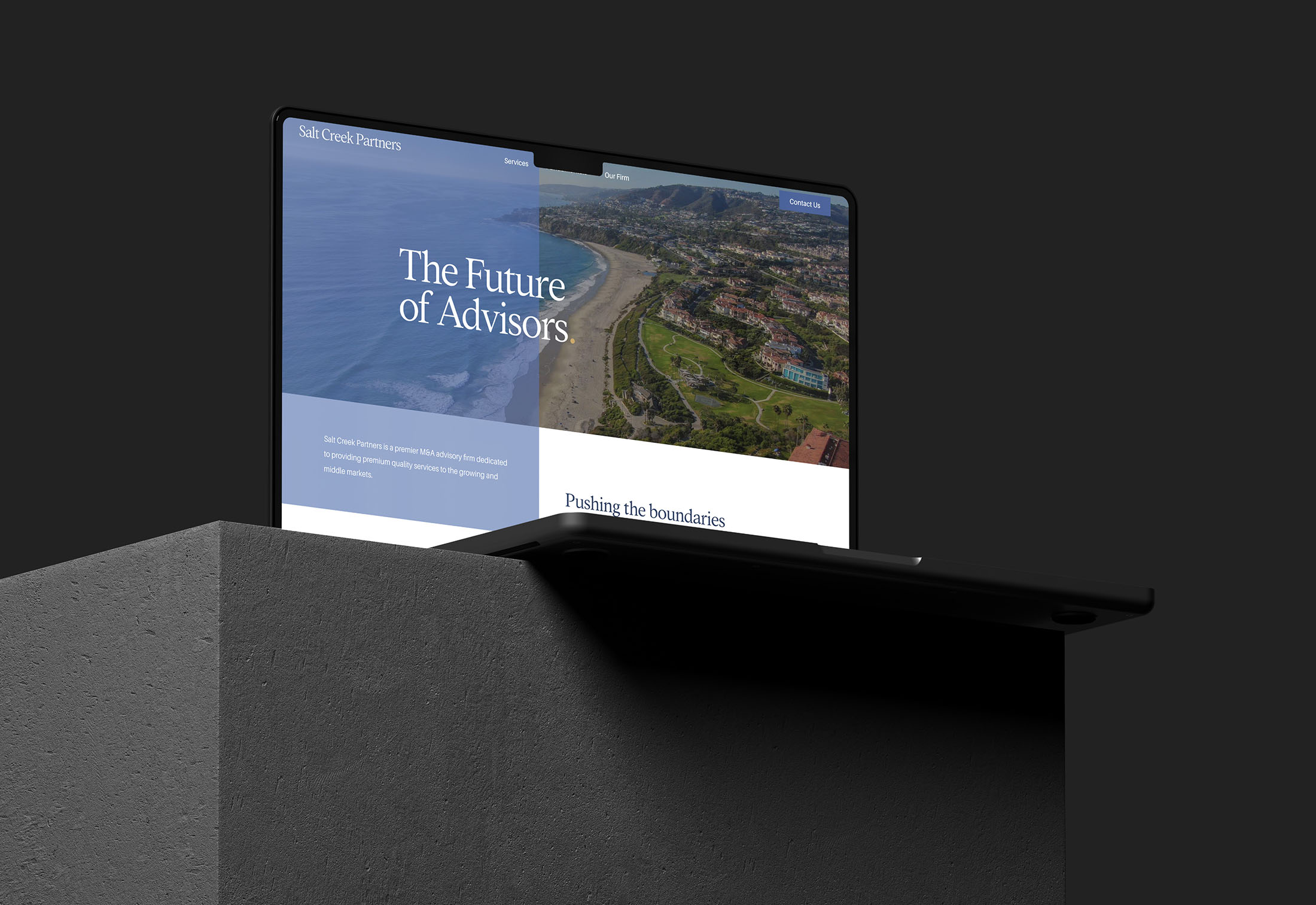
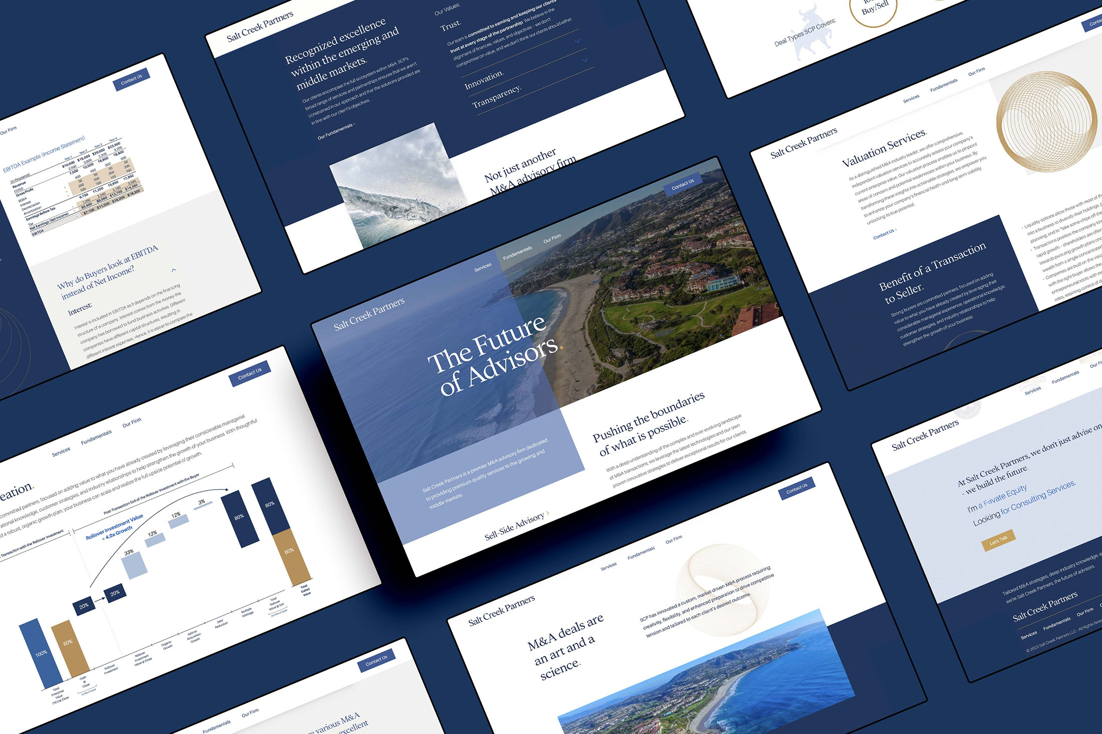
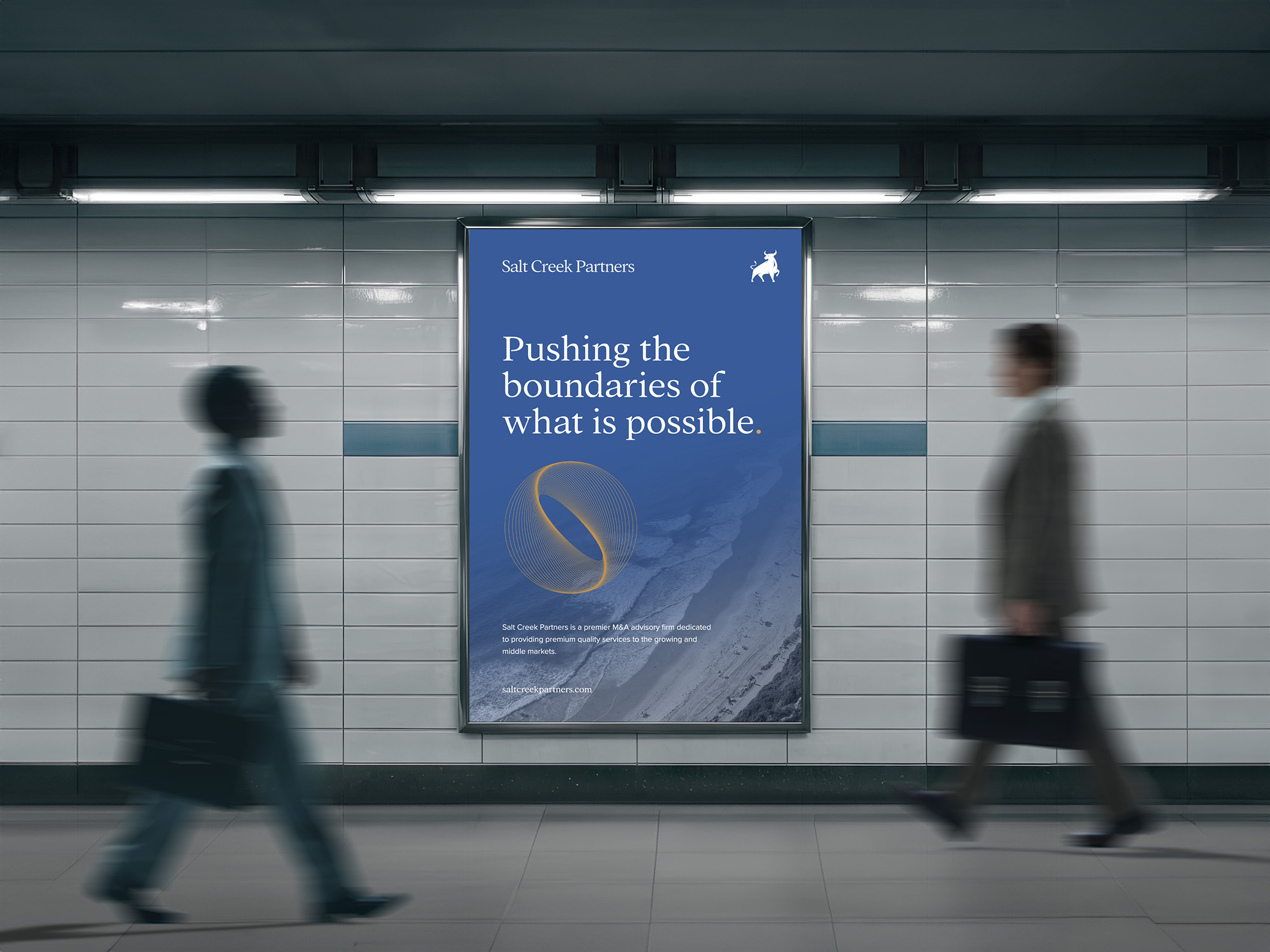
The Future of Advisors
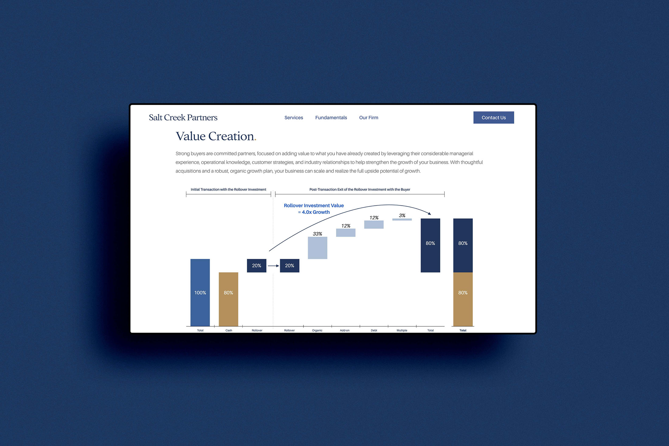
With a deep understanding of the fast-paced M&A landscape, Salt Creek Partners uses cutting-edge technology and innovative strategies to achieve exceptional outcomes—sophistication their brand needed to reflect. They came to us seeking an evolved identity, aiming for a brand and website that convey expertise, instill confidence, and drive growth. We transformed their brand symbol into something fresh and forward-thinking and crafted a website that balances simplicity and credibility, providing a powerful first impression and clear validation of their expertise for clients and partners.
The existing bull, while recognizable, was a purchased icon—a template available to anyone and everyone. For a brand moving as fast as Salt Creek, with rapid success and expansion, the risk of duplication was a legitimate concern. But we saw the potential to take this established symbol and rework it into something truly unique
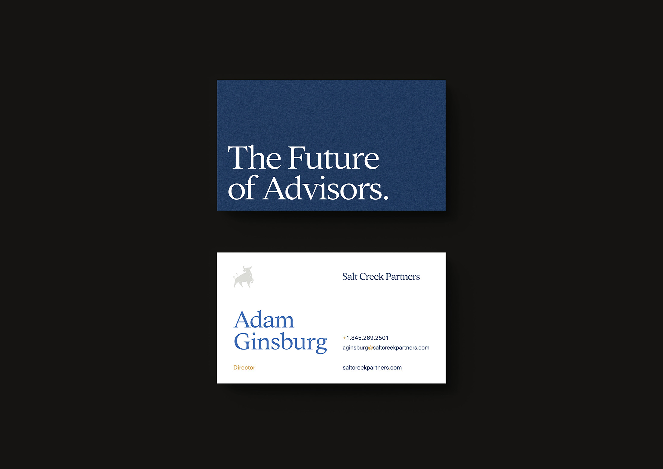
New Symbol
Our approach was to elevate the bull from a position of submission to one of power and confidence, transforming it from a bowing stance to a rising one. The new symbol captures a bull that stands firm, embodying resilience and forward momentum. This evolution not only reflects Salt Creek Partners’ commitment to pushing boundaries in the M&A landscape but also aligns with their core values—strength, confidence, and the respect for legacy.
The big picture...
You face challenges, we design solutions.
Own your brand, lead with conviction, and make great things happen.