“They were a delight to collaborate with and drove the project with such passion and consideration, extending way past the usual working boundaries... They were problem solvers of the highest degree and the standard of work was just outstanding.”
“Their systems and processes were clear and effective, their knowledge and guidance was top notch, they were organized, they worked to really understand our industry...”
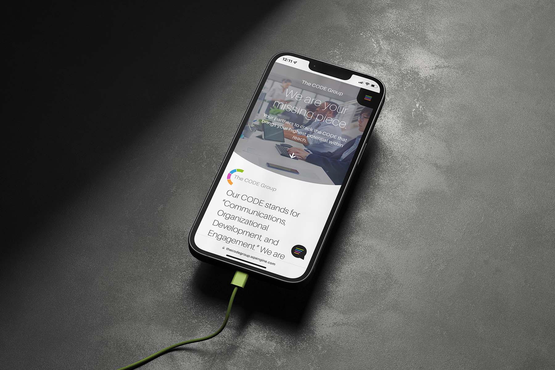
“Our entire team spoke of feeling supported and heard through every aspect of research & development. They went above and beyond, launching ahead of time, and always on time with everything they assured us would happen.”
“Very pleased with the result. Whiskey and Red goes 'all-in' for you, and somehow manages to create exactly what you are looking for without you knowing what you wanted.”
“Whiskey & Red are an amazing branding and web design team! I just finished working with them to build my new website and I'm so happy with the end product. I feel so fortunate that I got to work with them.”
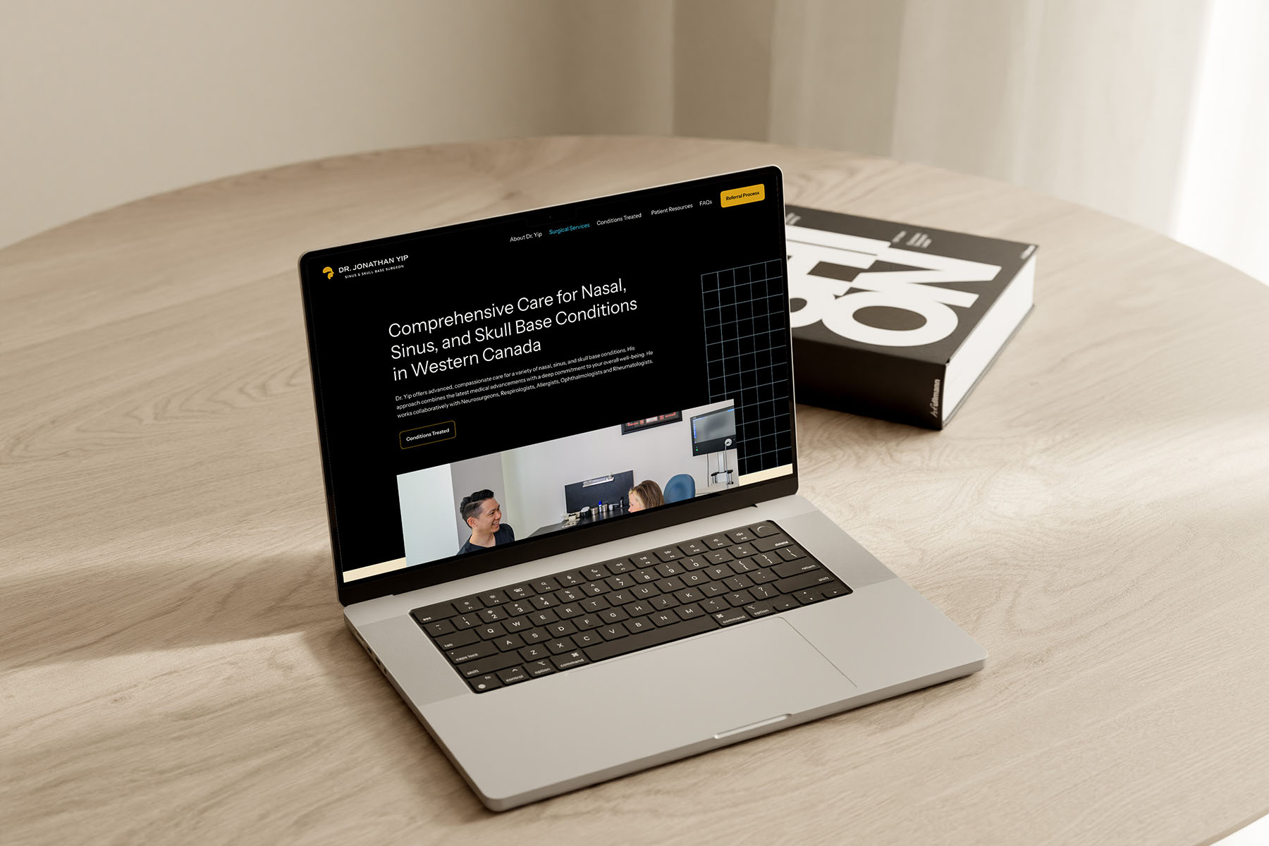
“Julie and Steve were amazing to work with from the initial meeting to our website launch. They were very thorough during the entire process... It was a huge pleasure working with them. We LOVE our website.”
“If you are looking for a great web design firm, you have found the best! Whiskey and Red did an amazing job with my website.”
“Whiskey & Red gave me the opportunity to be involved in the branding/website designing process, and by doing that, I have felt heard and valued as a customer. I highly recommend their services. Thank you for your beautiful work.”
“If you want to create a professional website that is easy to navigate, beautiful to view, and very effective at driving customers to your business then I highly recommend Whiskey & Red.”
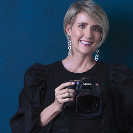
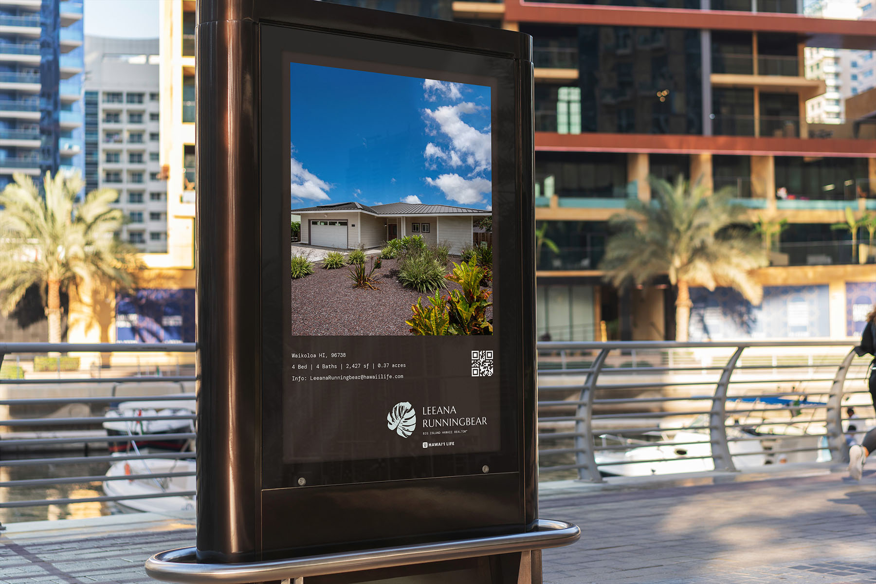
“Whiskey and Red is the best! The website that they designed and built for my business totally improved my photography business and increased my client base. They took my business to the next level and beyond.”
“They stuck to their timeline even when I asked for changes and adjustments and delivered an absolutely stunning website... I am so happy that I found them!”
“From the initial meeting to launch day of our new website they were always ahead of the curve… The response was quick and to the point, fixes were made right away and the end product was beyond what we could have hoped for!”
“Julie and Steve are a dynamic duo to say the least! Julie’s knowledge of style and creativity left me literally flabbergasted. They walk you through every step so you know exactly where their mind is at when creating the designs... AMAZING!”
“They have been my "web people" for 8 years and it's been amazing to have their support and expertise all these years… They are about efficiency, flow and getting you results.”